


Final Logo Mark, Jerry Baker Memorial Velodrome
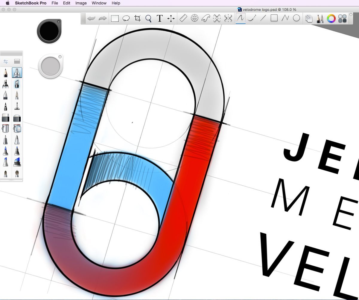
Preliminary concept sketch. The logo shape is a fusion of the letters, J and B with the shape of the velodrome in plan view. The B and J also capture the warmup circle, which is an easily identifiable feature of every track.
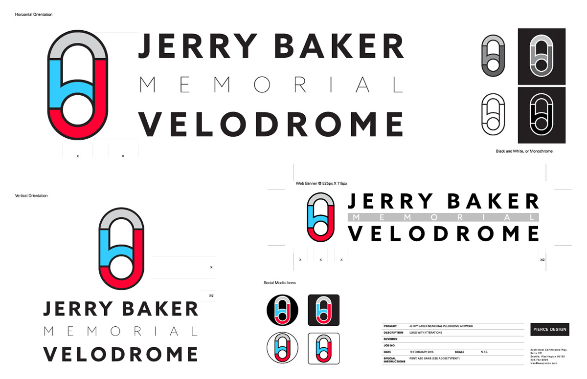
Logo useage guidelines. Due to the ad-hoc nature of the volunteer organization and variety of branding needs behind the Jerry Baker Memorial Velodrome, I left the logo flexible and easy to use.
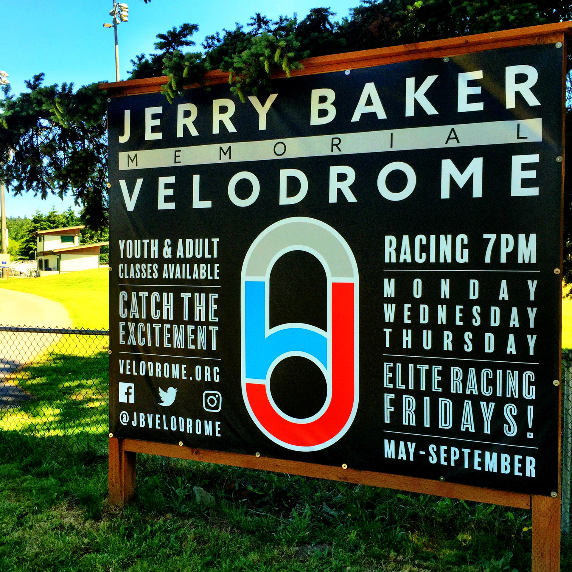
Entry Banner collateral
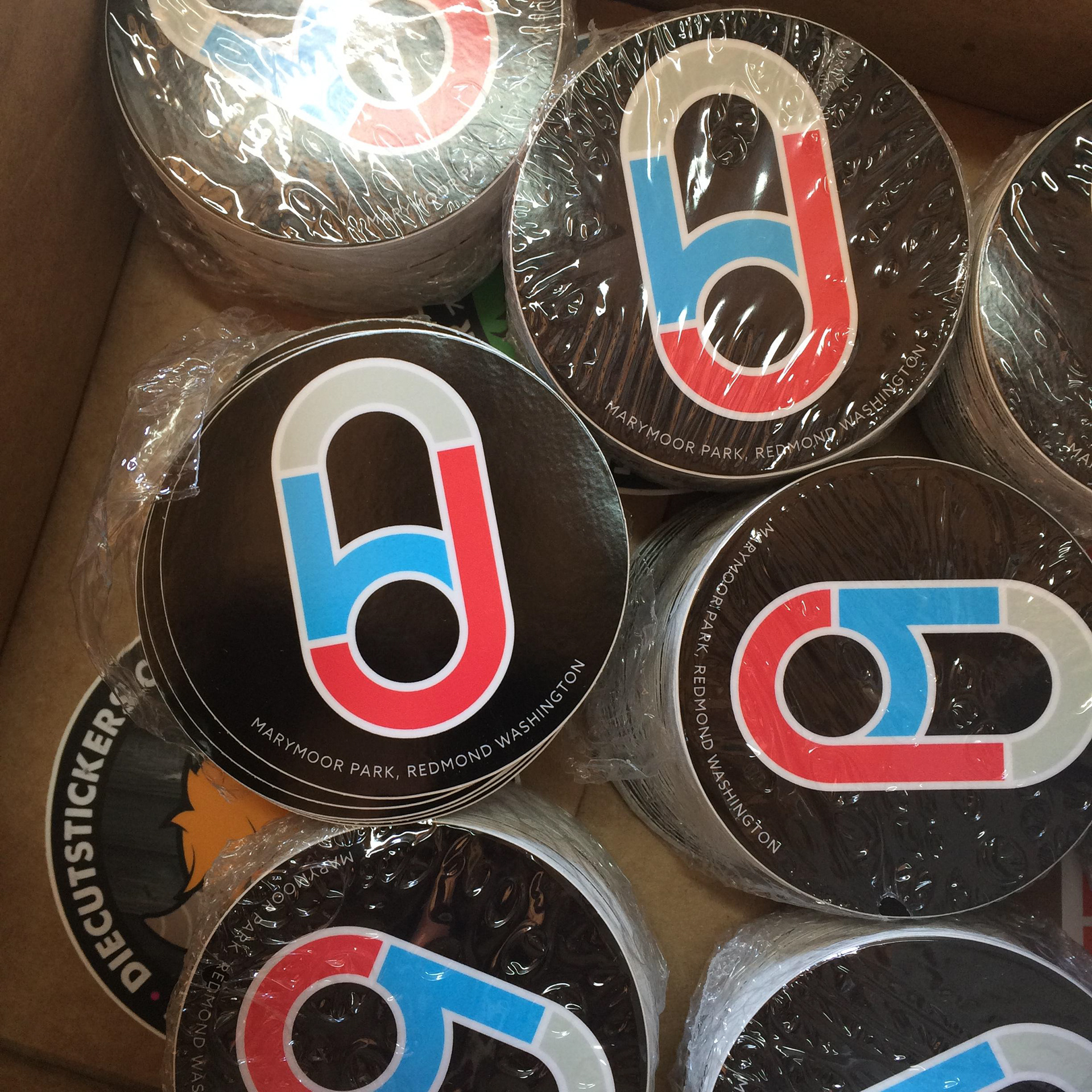
Promotional stickers (disk wheel valve covers for those in the know)
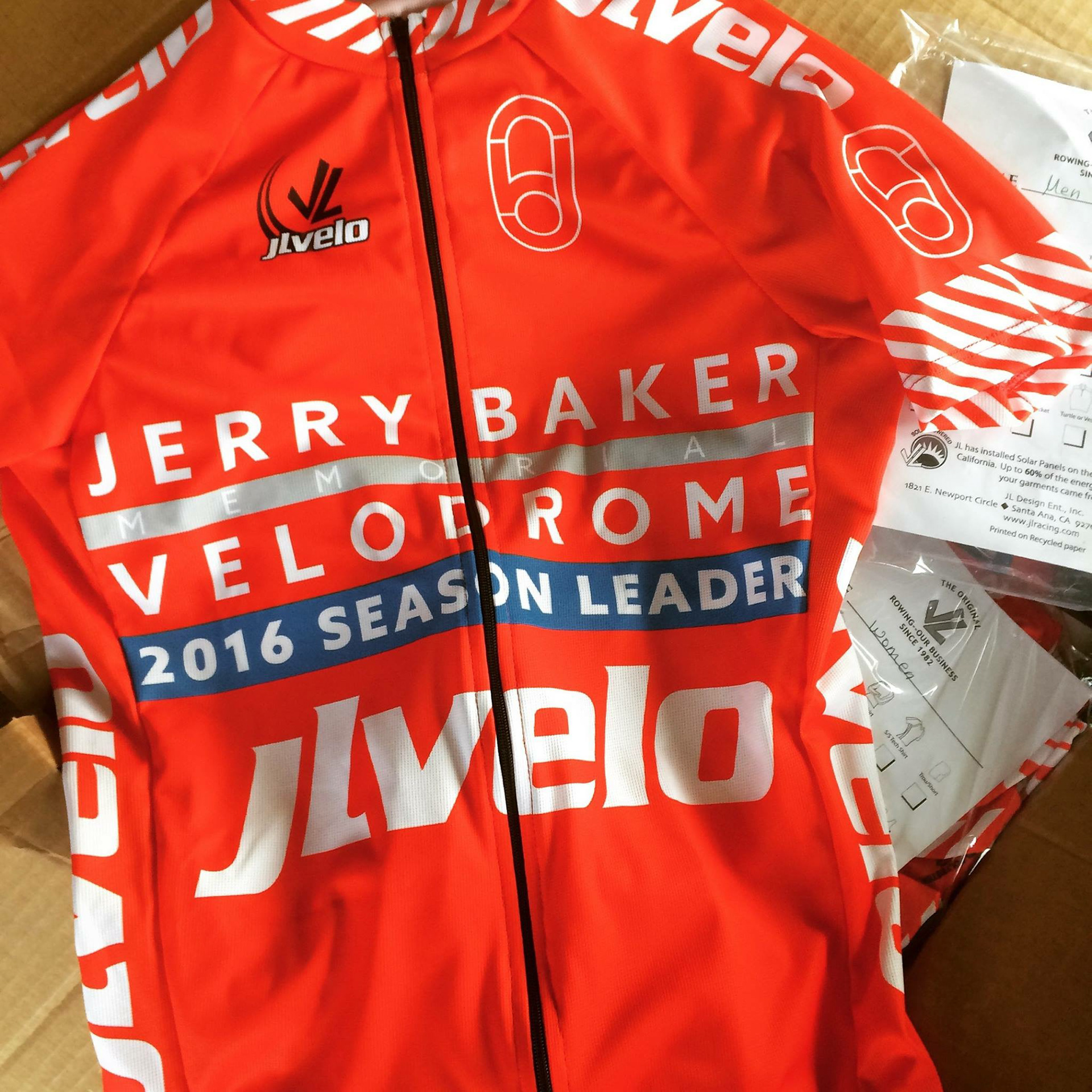
Season Race Leader's jerseys
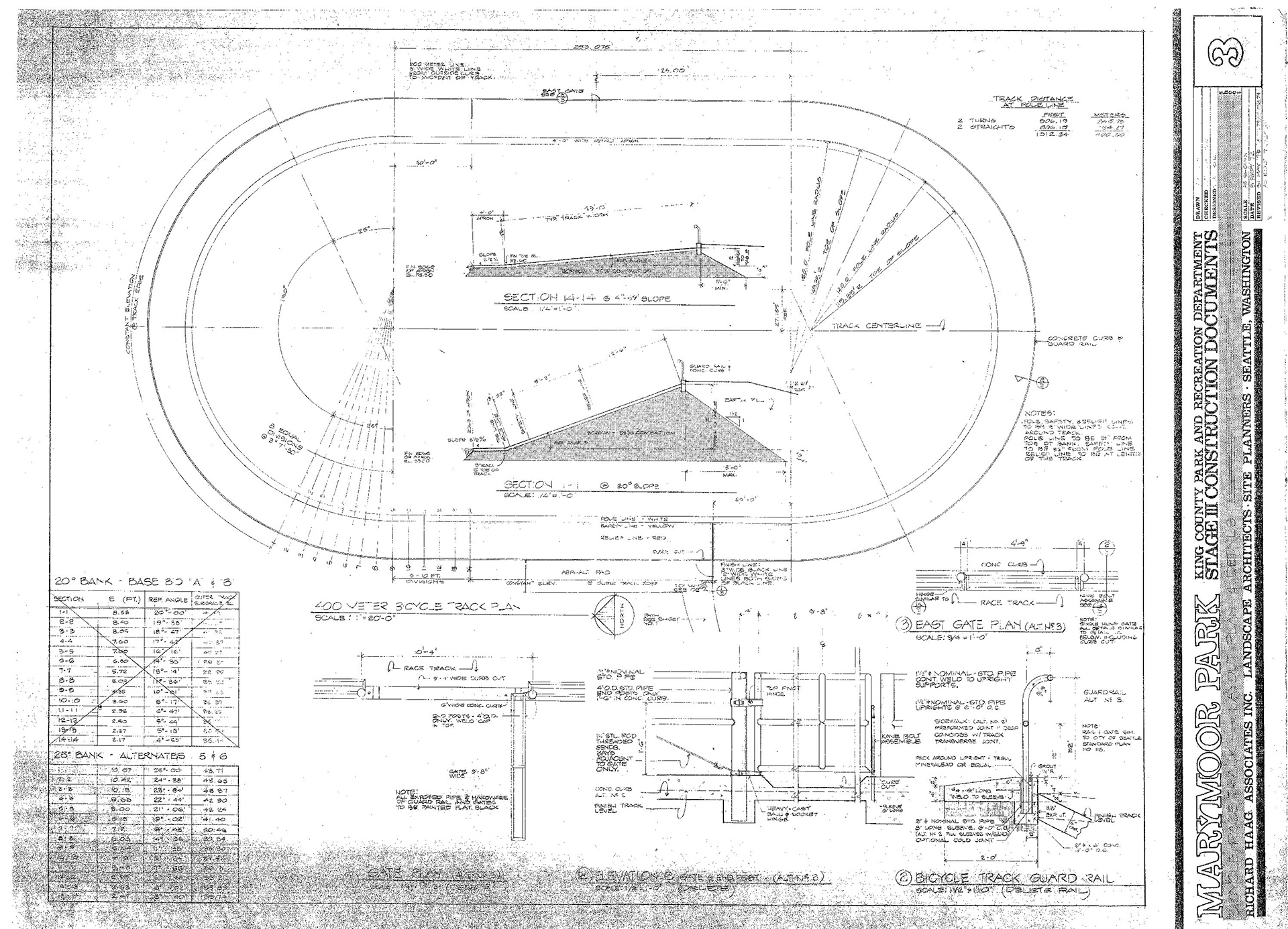
The original track build blueprints from 1974.